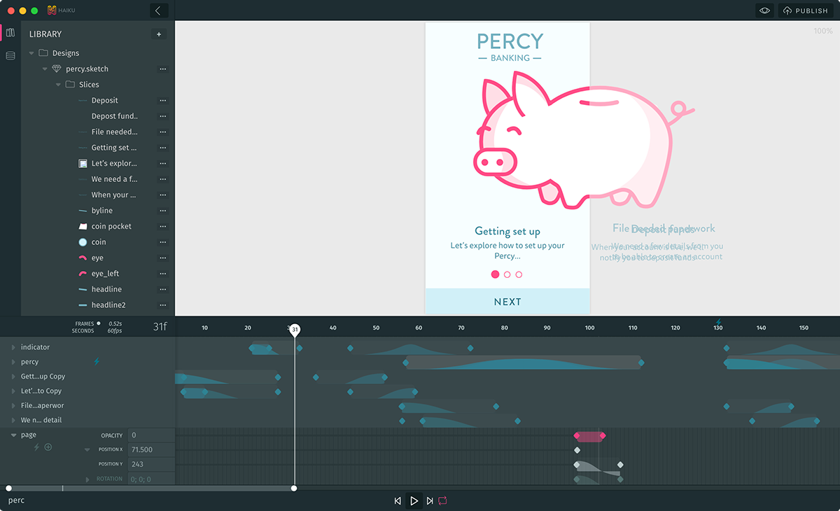
Have you ever painstakingly built an animation using code — JavaScript, or Core Animation, or CSS — and thought there must be a better way? Have you ever dreamed of a tool that lets you design the parts of your app the need designing, and code the parts that need coding?
We've dreamed of this, too! This is why we set out to build Haiku, a tool for desiging and building animated, cross-platform UI components. Our mission is to bring design and code closer together — and to do this, we do a lot of integrating.

Haiku integrates with Sketch so you can use familiar drawing tools; it integrates with Git and npm so that designers and developers can work with a shared version history; it integrates with Lottie so you can export native animations for Android and iOS; and it integrates with React so that your designed components work seamlessly with any React web app.
Now Haiku integrates with Vue, too. This means Haiku components are first-class citizens in Vue applications. Pull components in through npm, nest them with other Vue components, pass in live data through props — it's the same Vue you know and love, but a lot more animated.
Here's Evan You's take on it: (the creator of Vue)
Quite impressed with @HaikuForTeams - allows you to design complex animations with GUI and use in an existing Vue app as a component: https://t.co/3WaS37paNS
— Evan You (@youyuxi) February 28, 2018
Let me show you an example. I've crafted a very simple Whac-A-Mole game: all the animation and logic related to the game itself is handled internally by the Haiku component while the score tracking is handled by Vue. The component is able to communicate back and forth with the Vue app with ease.
Haiku automatically hosts Git repositories for every project you create (private by default). Here's the source for this component.
In this post we'll explore the basics of Haiku Core, the rendering engine that powers Haiku for Mac, as well as the new Vue adapter, while showing how we built out the adapter itself.
Haiku Core
Haiku Core itself is a platform-agnostic UI component library. Give it a JavaScript object that fits the specification of a Haiku component, and it will give you an object that describes how it should be rendered.
But just describing how to render isn't very interesting or useful. Normally, you want to see something on your screen! That's where the concept of adapters comes in.
In Haiku Core, adapters take care of turning the rendering and layout returned by the engine into an actual visible, animated, and interactive element — inside whatever the host platform is. Out of the box, Haiku Core ships with a DOM adapter (for rendering in web pages), a React DOM adapter (for rendering Haiku components inside React DOM components), and the Vue.js adapter. You can also export Haiku projects to Lottie, for native animation rendering on iOS, Android, and React.
Before diving into adapter-specific code, let's take a peek into the internals of Haiku Core and its relationship with Haiku for Mac in order to discover some of Haiku Core's possibilities and features.
Your design is code
With Haiku for Mac anyone can build interactive components for any web page or native app.
When you design in Haiku, you're writing code (well, Haiku does it for you). And when you edit the code, you're updating the design. This bridge between design and code goes both ways. This works because the Haiku design format is no more than a JavaScript object, which Haiku for Mac knows how to read and write.
We informally call this normalized definition of a component the bytecode. This way of representing components enables Haiku to provide an amazing set of features such as shared version histories for designers and developers.
From bytecode to live components
Here's an example of a simple component definition, to get a taste of what it looks like:
const definition = {
  timelines: {
    Default: {
      '#box': {
        // You can provide layout and style definitions...
        'style.width': {0: {value: '100px'}},
        'style.height': {0: {value: '100px'}},
        'style.backgroundColor': {0: {value: 'steelblue'}},
        // ...and you can also animate them!
        'rotation.z': {
          0: {value: 0, curve: 'linear'},
          2000: {value: 2 * Math.PI}
        }
      }
    }
  },
  template: `
    <div id="box">Hello Animation!</div>
  `
};
In order to render this component definition, Core needs a DOM element to attach the component and an optional set of options that allows you interact with your it by providing live data, hooking into its lifecycle events and more.
ADVANCED: Building the wrapper
If you want to use Haiku to design and build app components, you've already read far enough. However, if you want to know more about the internals, or would like to integrate Haiku with another library (looking at you, Angular!) then read on.
Now that we have a basic understanding of what's behind the covers, let's create a Vue wrapper that can be used for consumers of Core to render idiomatic components.
Inside of this component, we need to tell to Core where and how to attach our haiku, and we are going to do this by taking advantage of Vue lifecycle hooks:
- When the component is
mounted, we are going to create an instance of our haiku, just like we did in with our sample component definition above. - When the component is
destroyed, we are going to let know to our haiku that is being unmounted by calling the component instance methodcallUnmount.
Lastly, we are going to define a render function that it's going to render an empty div which we can use to attach our component:
const vueWrapper = {
  mounted() {
    this.haiku = factory(this.$el, {});
  },
  destroyed() {
    this.haiku.callUnmount();
  },
  render(createElement) {
    return createElement('div', {});
  }
};
Accepting options
As we saw before, Core is able to receive options, and our component is going to receive them via props.
But, since props can be updated once the component is already rendered, we also need to use the updated lifecycle hook to update the haiku instance with the new configuration by taking advantage of the haiku component instance method assignConfig.
Note: in this example, we are only accepting haikuOptions and haikuStates, but Core supports even more configuration options!
const vueWrapper = {
  props: {
    haikuOptions: Object,
    haikuStates: Object
  },
  mounted() {
    this.haiku = factory(this.$el, {
      options: this.$props.haikuOptions,
      states: this.$props.haikuStates
    });
  },
  updated() {
    this.haiku.assignConfig({
      options: this.$props.haikuOptions,
      states: this.$props.haikuStates
    });
  },
  render(createElement) {
    return createElement('div', {});
  }
};
Lifecycle events
A Haiku component also provides lifecycle hooks that are modeled after React lifecycle hooks.
Since Vue exposes a special syntax to deal with events, we want our wrapper to embrace it by providing an interface that looks like this:
<my-component :haikuComponentDidMount="myFunc"></my-component>
Haiku lifecycle hooks are declared in the config object that you pass to Core, so we'll need to update our mounted function with the proper hooks, adding a $emit call every time an event is triggered:
const vueWrapper = {
  //...
  mounted() {
    //...
    this.haiku = factory(this.$el, {
      //...
      onHaikuComponentWillInitialize: (component) => {
        this.$emit('haikuComponentWillInitialize', component);
      },
      onHaikuComponentDidMount: (component) => {
        this.$emit('haikuComponentDidMount', component);
      },
      onHaikuComponentWillMount: (component) => {
        this.$emit('haikuComponentWillMount', component);
      },
      onHaikuComponentDidInitialize: (component) => {
        this.$emit('haikuComponentDidInitialize', component);
      },
      onHaikuComponentWillUnmount: (component) => {
        this.$emit('haikuComponentWillUnmount', component);
      }
    });
  }
};
Wrapping it up
And that's it! The real adapter has some subtleties related to rendering and adaptation to the codebase, but that is the gist of it. If you want to see the full code, please take a look — it's all open source.
If you want to build an adapter for your favorite framework, we are open source and very much enjoy pull requests! If you need any help to do so, please ping us in our Slack Community.
DESIGNER PREVIEW Get Haiku For Mac


