Haiku allows you to bring your Figma designs to life by easily animating and publishing them as clean React components. This tutorial will guide you through the process.
Design in Figma
We're going to start by designing a button in Figma that we will later animate in Haiku.
We'll create a new file by clicking on the plus icon in the top left corner of the app.
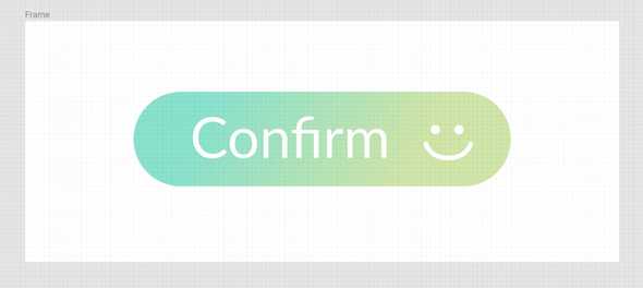
Then, we'll start by drawing a rounded rectangle, adding a color gradient and some text to create the button. Next, we'll add a smiley face. Use the ellipse tool to draw the ‘eyes’ and the Pen tool to draw a smile. If you want, you can rename these shapes in the Layers panel to the left.
Now we’re ready to start animating in Haiku! You can download the Haiku app here, if you haven't yet.
Import your design
If this is your first time using Haiku, check out this article and the on-boarding tour in the app.
We'll create a project by pressing the “New Project” button.
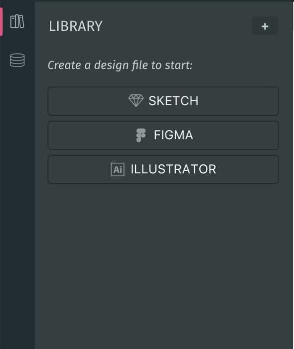
To import our slices from Figma, click the Figma button in the Library panel.
Haiku will then prompt us to log in with Figma and we will simply need to press ‘Allow Access’ to give Haiku access to our slices. Read a step by step guide to connect your Figma project here.
Animate in Haiku
We are going to animate our button using the two types of Actions available in Haiku, Element Actions and Frame Actions.
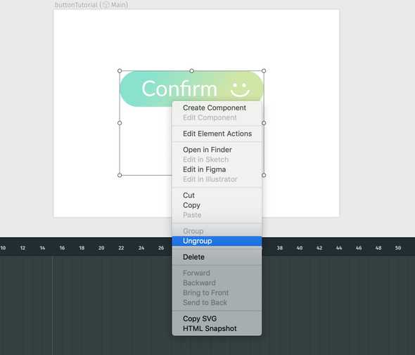
Start by dragging and dropping your slices onto the stage. In this case, I chose to group all the slices together in Figma, and ungroup them in Haiku to maintain their position and alignment. You can zoom in/out to help align them. Also, let's resize the stage to be the size of the button.
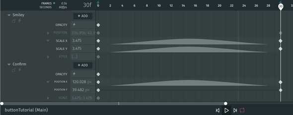
The button as we imported it is how we want it to appear at the end of the animation. So, in frame 30 we'll create keyframes for the smiley face's Scale X and Y properties to to keep its original values at this point in time. Now, do the same with the Position X property for the text of the button.
Now, for the initial appearance of our button, we'll move the ticker to frame 0 and change the smiley face's Scale (X and Y) to 0, select both the button's background and the text, and center the text using the align panel.
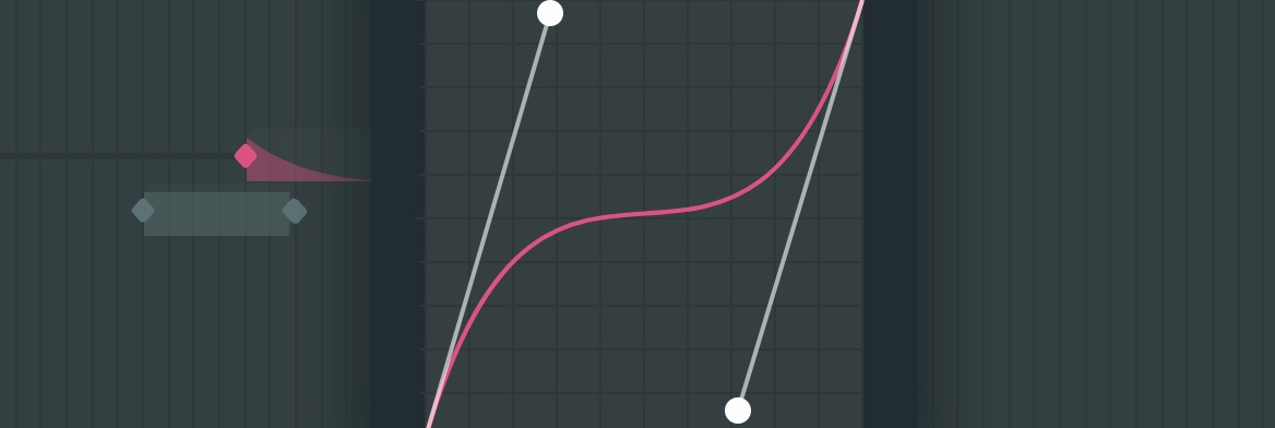
You'll notice that as we made those changes, the auto-tweening feature kicked in because the original values with which we imported our button changed, therefore the app assumes there is going to be an animation. You can change the default tweens to any of the transitions available in Haiku.
This is our result so far:
 Basic animation for our button
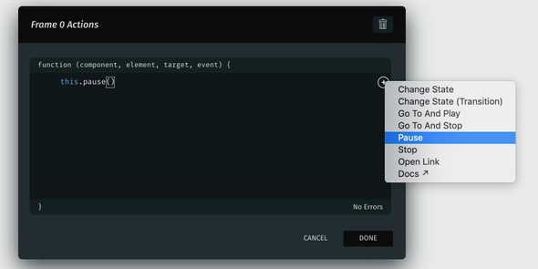
Now, we only want our animation to start playing when the user hovers over the button. To achieve this, we'll add a Frame Action on frame 0 to tell Haiku to pause the animation at that time.
If we go to Preview mode, we'll see that the animation no longer plays.
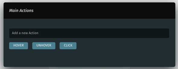
Next, we'll add an Element Action to the stage itself by clicking on the lightning icon up top. We'll add a Hover event, select the GotoAndPlay snippet and set it to frame 1. That means that when the user hovers over the button, the animation will jump to frame 1 and play from there.
Let's also add an Unhover event, select the GotoAndStop snippet and set it to frame 0. This will make our button go back to its normal state when the user removes the cursor from it.
Finally, let's add a stop Frame Action on frame 30, so that our animation doesn't loop back to frame 0.
 Hover animation complete
To make it more fun, let's create a Clicked state for our button. To do it, import another bit of text from Figma (in this case we'll use the word “Done”) and instantiate it on frame 0 right on top of the word “Confirm”, that is, centered inside the button.
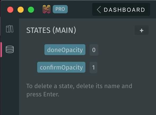
We then need to create two States:
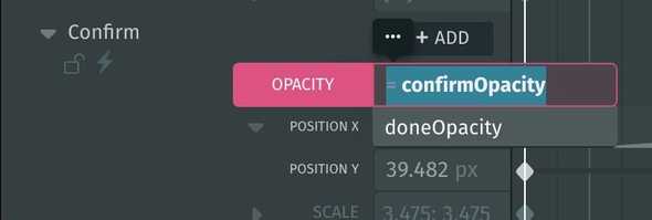
We'll summon these States on the Opacity property of our elements using Expressions. Assign the “confirmOpacity” State to both the smiley face and the “Confirm” word, and the “doneOpacity” State to the “Done” word, all in frame 0.
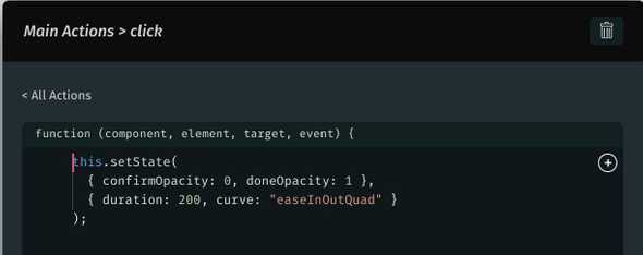
Next, we'll open our Element Actions panel again and add a Click event. To recap, we now have Hover, Unhover and Click events set up.
Add the Change State (Transition) snippet and interchange the values of our two States (from 0 to 1, and from 1 to 0). Let's tweak the default transition as well.
This will make the “Confirm” word and smiley face fade out, and the “Done” word fade in when the button is clicked.
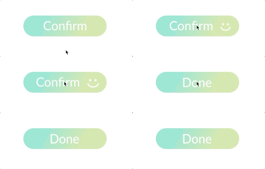 The final result
We’re almost done. Now we can publish our Haiku and import it as a component into a React project.
Publish the animation
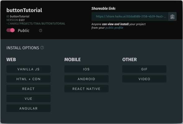
To publish your Haiku, simply press the ‘Publish’ button next to the Preview mode in the top right corner of Haiku.
As you can see, Haiku provides various install options for web and mobile platforms.
Import into React
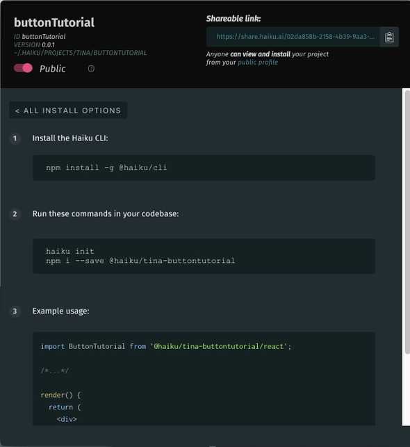
In the Publish modal, click on the React button to view the necessary steps to get your Haiku design up and running in React.
Following the steps in the Publish modal, we need to:
- Install the Haiku CLI if you haven't already done so.
- Import the animation into your React project with the following command:
$ haiku init
$ npm i --save @haiku/username-tutorialName
You need to replace the “username” and “tutorialName” placeholders with your actual data.
- Import this React Component, and add it to your render function. Haiku provides a usage example, which you can add into your project along with the statement to call your component.
And that’s it! Your Haiku component is now live in your React project.
Try it yourself
Here's the original project used for this tutorial:
https://share.haiku.ai/u/Tina/buttonTutorial
You can fork it and take it for a spin!
Keep up to date with the latest on:


